The Cabinet of Natural Wonders – Graz & Wien part 4

Leave a comment

I have now visited it twice, the Naturhistorisches Museum in Vienna, and I’m still not done with it. I have seen the most of the first floor twice and on both times it has been equally exiting. Maybe next time I will make it to the exhibitions of the second floor.

FB_Graz&Wien2015a

Go in as soon as it opens. Trust me, you’ll need the whole day.

The tour begins with minerals, rocks and fossils and since it is an imperial collection, there are hordes of those. Last time my hubby said he would not be interested in the mineral collection. Yeah, right… We ended up going through every single display. There are the traditional mineral samples, cabinet after a cabinet, room after a room:

VP_Graz&Wien2016e

Green stuff. I can tell where it came from (it reads in the labels) but I have no idea what it is.

While they might seem boring and a bit intimidating at first glance, give them a chance and look carefully. They are quite beautiful and intriguing. Like this miniature ice berg:

VP_Graz&Wien2016f

A chunk of Aragonite.

But since it is an IMPERIAL collection, it’s not just exhaustive (after a few hours, quite literally), it is also breathtaking size-wise. For a scientific collection it would be enough to have a comprehensive collection of illustrative samples but an imperial collection is a collection of curiosities. It’s not enough to have all the samples – a bit like having all the Pokémons – you need to have the most impressive samples you can get and there is nothing more impressive than something huge:

VP_Graz&WIen2015b

A rock crystal. There is a larger one but it’s so huge it doesn’t photograph well.

VP_Graz&Wien2015c

A topaz. Merely 117 kg. For a ring, maybe?

Then there are the gold nuggets with one, the goldenklumpen “Welcome”, weighing precisely 68,98 kg. One needs to be exact with these things. It is a natural history museum after all. Which also means that it’s not just all samples and impressiveness. One of the really interesting displays is the one built in old wall cabinets explaining the etymology and the logic of the naming stuff. Why there is rubintyrann, the vermilion flycatcher in English, or zebramarmor and zebrajaspis. The minerals and stones are displayed next to their namesake birds and other critters and it’s easy to get the idea even when you don’t speak a word of German.

VP_Graz&Wien2015e

The fossil collection is just as comprehensive and impressive. My favourite one is this large fossil of Scyphocrinites that used to float around oceans all around the wolrd some 410 million years ago. The amount of detail is amazing! You can click on the picture to enlarge it.

VP_Graz&Wien2015d

Scyphocrinites in detail.

The museum also has few replicas of fossils of large animals, like this Devonian fish. The head alone was close to 1,5 m long. The real things are too fragile to be put on display, but the replicas are so detailed that it doesn’t matter much. Besides there are real ones too, even a real dinosaur leg bone that you can touch. It’s worn smooth and polished where the visitors have caressed it.

VP_kalanpää

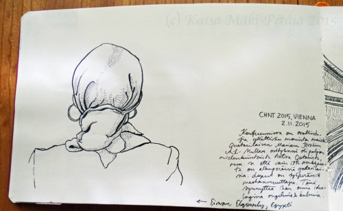
It took an hour to draw this. School classes kept on getting in the way.

Last time I had time to draw other stuff too:

VP_Basalttipommi

A volcanic bomb about 50 cm high and a tiny trilobite.

What is interesting is that the human evolution and prehistoric cultures are placed in this museum. The evolution part I get, but the prehistoric art is slightly out of place. I suppose it’s an old divide dating back to the imperial days and the 19th century sensibilities that did not see it as art proper. After all, many old natural history museums also house anthropological collections which were considered primitive and therefore belonging within the natural historical and not art. And so the Naturlhistorisches Museum is where you go when you want to see the Venus of Willendorf and other famous prehistoric venuses. I decided to draw it from a slightly different angle to make it more interesting. What a bum!

VP_WillenVenus

Earl Grey too had come to see the famous Venus of W.

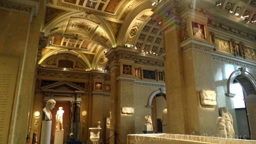
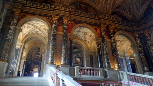
When you start too feel tired and drained it’s time to head for the museum café. Seriously. Go and have a cuppa. The whole building is – just as its counterpart, the art history museum, is – a sight so see in itself. Don’t forget to look up while touring the exhibits as every room is decorated according to its theme with paintings and sculptures.  Take a look at the dinosaur room’s statues especially. The café is situated under the central dome which is much more modest than its counterpart across the yard:

VP_museokahvila_LuonnonHIst

It’s difficult to drink your cuppa while staring at the ceiling.

And the food it delicious. Do try the traditional pancake and apple strudel. The price will double once you walk across to the art historical museum…

VP_pannaria&strudelia


Climbing up a Mountain – Graz &Wien part 3

Leave a comment

I returned to Austria last November but this time with my hubby. We first visited our friends in Graz and climbed our very first mountain ever. That was so awesome! First of all, you need to keep in mind this is my home landscape:

Valokuva0335

Here in Keski-Pohjanmaa region anything over 2 meters above the sea level is considered a hill. Seriously. When my hubby first moved here I tried to explain where friend of mine was living. “It’s the red house right on the top of the Koutonen-hill,” I said. My hubby gave me a perplexed look. I offered a more detailed description and he replied: “Oh, I hadn’t realised there is a hill there.”

See what I mean?

So a mountain, even a small one, is a Big Thing in my books.

VP_Graz&Wien2016d

Even the relatively gentle slopes around Graz are impressive in my eyes.

The mountain we tackled was the Schöckl. It’s not that high as far as mountains go, but a mountain nevertheless. Our initial plan was to take the cable car up but it happened to be closed for an inspection that day – which we discovered only after we got there. That put a slight strain on our timetable but we still decided to climb up. We took a path that circled around the peak, a route our friends had not taken before even though they are regular visitors. The day was warm and sunny and  the views were quite spectacular. It had rained the day before and there had already been a quite a bit of snow on the Schöckl but the warm Föhn-wind had melted it all away. In fact, the weather felt like springtime!

VP_Graz&Wien2016a

The northwards view about 2/3 up to the top.

It’s just mindbogglingly beautiful to look across the landscape from an elevated position. Things in the landscape seem both faraway and oddly within reach. I can understand why they have used the same perspective in classical Chinese landscape paintings. There is something both awe-inspiring and numinous in such a perspective. This is what the Aesthetics’ concept of Sublime was created for.

While perfectly sunny the weather on top was chilling to the bone because of the wind .

VP_Graz&Wien2016b

Not quite the highest point but who cares.

We had planned to have a picnic once we reached the peak but it was just too cold and we had to settle for a more shielded spot. Still, the prospect was magnificent, and while the wind certainly made us finish our meal quickly, the sun was also getting closer and closer to the horizon. We decided to get a more direct route down which also meant a more steep descent. We needed to hurry if we were to get past the steepest parts before sunset. It does get dark quite quickly – especially in comparison out lingering sunsets in Finland.

VP_Graz&Wien2016c

The southward side and views to the south-east.

Seeing the sun set from a mountain is one of the most spectacular sights. To watch how the blue, cold, and mysterious shadows creep across the landscape below you, and how the green landscape turns into a sea of blue hue with pinkish-orange islands of hills and smaller mountains. That’s when the air, the actual atmosphere itself becomes somehow more tangible. You can see and experience the vastness of the planet, that the space between things-of-the-world is not a void but a substance.

I can hardly wait for the next time.

Summer of Clouds

2 Comments

It has been a summer of tremendous clouds. There has been rainy days with monotonous greyness, days of sweltering azure (can you use that word like that?) and everything in between. It has been a perfect summer for some cloudspotting.

VP_pilvet02

From a walk with our dog, Kili. Apparently we fought of a gigantic swarm of flies, and had to overtake a half a metre long adder on the path. It was searingly hot so I sketched like a lightning.

However, form a sketcher’s point of view the summer has been problematic. If it wasn’t raining, it was so hot that watercolours dried far too quickly making it next to impossible to use wet-on-wet properly. So I was usually left with two choices: sketch real quickly or not at all.

The beginning of the August saw a change in the weather as the thunderstorms arrived. Some days were tropical (really, they said that on the TV’s forecast): humid, warm nights were followed by sultry mornings and afternoon thunder showers. The monotonous rain clouds changed into towering thunderclouds.

VP_taivas08

A thunder front advancing from the east.

That made sketching clouds a lot easier. Especially as I could see approaching showers well before they hit and look for shelter. Often the clouds rolled past in rows making the landscape seem even vaster and boundless. Pohjanmaa region is clearly the Finnish version of the Big Sky Country. Except for the mountains.

VP_taivas05

Then the weather changed again and the clouds with it. The clearly shaped cumuli lost their firmness – a certain sign that the autumn is suddenly just around the corner. Those partly dissolved clouds presented a new sketching challenge, but it was a delight to sit in the open and follow the clouds go by.

VP_pilvet01

Sometimes they had the feel of gigantic, monumental beasts floating unhurriedly across the landscape, being massive and insubstantial all at once.

VP_taivas04

A big sky behemoth.

VP_taivas03

The winter is coming – as it always does – and these clouds a the first promise of snow.

Then last Monday I saw clouds that made my summer. We were driving towards the West on our way to the town of Kokkola. It was far too early (for me at least), around 6.30 AM, and there was massif of storm clouds rising above the sea some 15 km from where I took this photo:

VP_taivas07

A lenticular cloud above low hanging storm clouds.

The cloud massif was – phenomenal. So many different kinds of formations that I could have spend several hours watching their evolution. But the cherry on top was that lenticular cloud floating almost immobilized above the massif. We don’t often get lenticular clouds over here. I suppose it’s because the landscape is rather flat, i.e. it’s relief is shallow, and to my understanding lenticular clouds usually form above high hills, mountains and such. What a treat!

Imperial Curiosities – Graz & Wien part 2

2 Comments

While in Vienna for an archeological conference last November, I sneaked away for a visit in the Kunsthistoriches Museum, the Art Historical Museum. I entered soon after it had opened for the day and exited 7 hours later – and I hadn’t seen even the half of it.

The museum seems to have everything from the Ancient Rome and Greece to the modern and the contemporary, from polished gems to huge canvases. If you go through the museum following the chronological order from the oldest to the latest, the first parts are more like a curiosity cabinet and that makes it even more fascinating. It is easy to imagine that you are visiting the private collections of the emperor seeing his favourite curiosities – which most of the artifacts and works of art originally were. The splendour, the sumptuousness, the sheer extravagance is breathtaking. For example, take a look at this vase:

VP_Itävalta10

Looks like crystal, doesn’t it, but it’s not. It is actually made of a single quartz crystal, a rock crystal, not glass. It big, huge, actually: maybe 50cm from the base to the top. And it was not the only one. If you look carefully, you can see two others behind it, and that’s not all of them. There are dozens of various sizes on display!

It’s difficult to comprehend the amount of wealth that made collecting on this scale possible.

Another impressive piece of craftsmanship were these structurally realistic and extremely detailed, delicate bouquets made of various metals. The patience it must take to create one of these:

VP_Itävalta11

Nice, but I wouldn’t want to dust these. Suppose that’s why one would have an army of servants…

There were so many amazing works of art that I just walked from one to the next in complete awe. It wasn’t until I got to the Roman and Greek collections that I managed to draw something. The Classical statues and other artifacts were more familiar and they therefore did not left me as wonderstruck as the other curiosities. This classical athlete/prince was one of my favourites:

VP_Itävalta13

The bronzes and other statues were extremely well lit, as you can see. The light levels were rather low (it’s not necessary for the conservation) and spotlights highlighted the statues beautifully. (Hihii!) But seriously, an even, monotonous lighting is not the best for three dimensional works of art. A more subdued and directional light reveals the character of the statues. Also, the museum had succeeded in avoiding one of the most annoying mishaps of museum lighting: the head of the visitor shading the object. You might have noticed this in most museums. Often the spotlights are placed so that when you get closer to a vitrine to have a closer look as something, your head and shoulders get in front of the light and you unavoidably cast a shadow on the object. No matter how you try to move, the object remains in shadow unless you move back and you again can’t see the detail you were interested in. Here this was seldom a problem. All the artifacts in these pictures were in vitrines but, as you can see, there are only a few reflections from the glass.

VP_Itävalta12

The was my favourite one. It’s not a Classical but a Neoclassical sculpture. Sadly I have lost the piece of paper on which I wrote the artist’s name.

There ware so many incredible artifacts there that it would have been easy to become lost in photographing everything I saw. I did manage to fight the urge and drew these two treasures:

VP_Itävalta P05

I bet Eutropios lit up the room when he walked in.

The one on the left was a bust of a really sour looking fella. Not your standard Classical head. Delightful! The one on the right was a small, maybe 6-7cm tall bronze figurine, a kind of an idol. Sadly there was very little information available in English in the exhibition. I really would like to know more about these disfigured idols.

VP_Itävalta15

It wasn’t only the objects of art that were impressive, the museum building itself is magnificent. This, of course, should not be surprising. What else could an originally imperial art museum be! However, the trouble with imperial splendour is that it sometimes overwhelms the art, like here in the hall of classical marbles where the sculptures were lost in the marble walls and gilded ceilings. Sometimes you just can’t tell the trees from the forest (not the other way round).

The marbles hall aside, the building is an art historical wonder in itself. You could spend a day looking at it alone, drinking in all the architectural details, period features, and intertextual clues and icons. Sitting in the upper restaurant was in itself a superb experience. And the lunch wasn’t too bad either.

VP_Itävalta14

Now this is a proper staircase.

It was a wonderful seven hours but while it uplifted me, it was also slightly exhausting. In a way is was a delight to return to the conference the next morning and to spend most of the day listening to various presentations. Not that they were dreary but they are less exiting in an electrifying kind of a way. More subdued and intellectually inspiring in other ways. Though I would love to be there when a scientific presentation gets the audience to jump up in excitement…

VP_Itävalta16

Mountains and Imperial Splendour – Graz & Wien part 1

Leave a comment

I’ve still been feeling slightly drained after my dissertation (even though that was two years ago) and last winter was pretty busy as I started my work at the uni of Jyväskylä, Department of Art and Culture Studies last autumn. I work as a post doctoral researcher but the the bulk of my work seems to be teaching and tutoring which has sadly meant there has been very little time and energy left for my own research. Maybe it will be better this winter.

I did get to go on one conference trip last November. Me and my friend had a joint presentation in the annual archeological conference, CHNT – Conference on Cultural Heritage and New Technologies, in Wien, Austria. (The link takes you to the site of this years conference.) That was great! I first traveled to the city of Graz where my friend lives and spent a weekend there polishing up our presentation and enjoying the landscape. What a treat! the weather was magnificent, all sunshine, breathtaking mountains and autumn coloured forests.

VP_Itävalta01

This felt just like Lothlórien! (The photo looks wonky because I tried this 360-decrees-setting that my cameraphone has.)

My favourite spot was this small chapel on a ridge in a small village:

VP_Itävalta02

We stopped there for awhile and I tried to sketch the landscape but it did not turnout so well. Maybe it was because I was so in awe of the view, but even if I’m not happy with the sketch itself, drawing and painting it created an extremely vivid memory of being in that place and within that landscape. I will be writing a philosophical article on it soon…

VP_Itävalta P01

Not completely pleased with it but see it still makes me feel like I’m still there. That’s interesting…

On Sunday we traveled to Wien where they hold these conferences. The venue was (and still is) the humble city hall of the once imperial capital, Wien:

VP_Itävalta03

The City Hall of Wien, Austria.

No, not that white classical temple. It’s that cathedral looking building in the background. Aye, it is HUGE. Just look at the size of the central courtyard:

VP_Itävalta04

It used to take a lot of office space to run the capital of an empire.

Apparently they have a too much space for contemporary bureaucracy (it’s the computers, I think. They take less space than thousands of filing cabinets and endless rows of typing typists.) My friend told me that one third of the complex is now empty and the city is trying to find new usage for it. It’s not like they can simply tear it down just because the upkeep costs a fortune.

It’s even better inside. This was the staircase leading up to our conference venue:

VP_Itävalta05

And the conference rooms themselves! Someone from USA noted that this was unbelievable as the conference venues back is States were just drearily dull grey, windowless conference centres. This, now this was something completely different!

VP_Itävalta06

I think I could fit one of the chandeliers from the conference rooms into our living room. But I would have to figure out what to do with the furniture – There would be no room left…

There was, like there always is in conferences, some time for sketching. Here’s what I did:

VP_Itävalta P02

One of the rooms had old heraldic tapestries.

VP_Itävalta P03

No conference is complete without drawings of people from behind.

VP_Itävalta P06

This year there were lots of topknots and buns. The man drawn in black was an Italian archeologist.

On the last night we had the traditional conference dinner which this time was a bit more glamorous than usually. The conference was held for 20th time (in row!) and the mayor of Wien treated us with a special dinner. The tables were set in the official banquet room:

VP_Itävalta07.jpg

Apparently there can’t be too much gold when you are decorating in an imperial scale.

I managed a quick sketch while waiting for the dinner to start. It does take some time when 200 dinner guests try to find their seats.

VP_Itävalta P04

I have no idea who these blokes are but they must be important enough to have their statue standing in a place like that. Marble, of course, and a gilded canopy above each one.

I sneaked away for two days from the conference (archeology is not my field of expertise after all) and visited some pretty awesome places and saw some things I have always wanted to see. More about that on the next post.

P.s. These days I just can’t be bothered to actually scan my drawings. The scanner I have is getting a bit too old for my laptop and photographing is just so much faster. That’s why the sketch photos are what they are. You can’t always have good lighting.

Daleks in Nineveh

Leave a comment

See?!

VP_dalek

It’s clearly a dalek in disguise attacking a walled city in a panel from the North Palace of the ancient city of Nineveh. Either that or a tank.

Kinda hoping it is a tank.

If it is a dalek then where is Doctor Who? Is there a panel, a vase or a statue of him hidden somewhere in the vast collections of The British Museum? Do they have the Tardis? No, wait, that actually seems to be parked here.

Makes me wonder what I will find the next time I spend three days roaming about the British Museum.

Proof of Time Travel?

Leave a comment

Never mind it’s been more than a year without a post. I have something much more interesting to show you.

Last week we spent five days in London and three of them in the British Museum. That meant we had time to see maybe a third of the stuff on display. Which means we need to go back there someday. I did draw some of the artifacts but more about that in another post. This is far more important.

Have you read any of those articles online that claim they have found evidence of time travel from old photographs? You know, those pictures with people who look almost exactly like some famous person of today? If you haven’t, just google it and you’ll see.

I don’t know about those photos. They are so easy to fabricate. These days one can Photoshop anything it seems. What I found is hard evidence – literally.

First I noticed this ancient Greek lekythos, a kind of an amphora that was often used in funerals and thus they are often decorated with scenes depicting funerals and the deceased. The picture on this particular lekythos was, according to the museum’s object card, a depiction of a departed young woman who is saddened to leave behind the world of the living.

Really?

VP_Sylttty1

Looks more like young Sylvester Stallone to me. I guess it’s easy to interpret the person as a woman by her hairstyle but she does look a bit masculine, don’t you think? Think of Stallone as Rambo and suddenly the hairdo makes sense. Just add a headband. See?

I suppose someone might not agree with me on that but how about this then:

VP_Syltty2

Sylvester Stallone has traveled back in time to ancient Greece more than once. You have seen the evidence. I rest my case.

Oh, wait.

Maybe he’s a time lord…

The Blue Book

1 Comment

Alright. So my New Year’s promise of trying to publish something weekly has not held. That, however, does not mean I have been lazy, so sir! So far the first three months of 2015 have been most productive.

One of my Creative Heroes, Nina Johansson, started a year-long project called Boggle My Mind to ‘wake up her sleeping imagination’ as she puts is. She challenged herself to draw something from her imagination every day. She posts her drawings daily on Tumbler. Do take a look. They are fantastic in the very meaning of the word.

I’ve been wanting to awaken my imagination for some time too but Nina’s challenge felt a bit too much. I know getting into something like that would just be handing my inner critic ammunition for its heavy artillery. But I liked the idea: a whole book dedicated to a single theme and cause. But what to do? What would be something that would inspire but still set the bar low enough to make it easier to keep the inner critic in check.

This is what I came up with: The Blue Book. The rules are simple: 1. Use only blue. Watercolours, colour pencils, anything goes as long as it’s blue. 2. Whole spread at a time. 3. Anything goes designwise as long as it’s blue. If nothing else comes to mind I’ll paint the spread blue. 4. Aim at doing a spread a day but don’t take it too seriously. I missed a whole week lately as I was in Oslo, Norway, participating on a conference. I did draw other things there so there you go.

Here are the first 9 pages. More to follow.

This is the blue that gave me the idea.

This is the blue that gave me the idea.

First spread: indigo which is my new favourite colour.

First spread: indigo which is my new favourite colour.

Second spread: lines with watercolour pen and water sprayed on top.

Second spread: lines with watercolour pen and water sprayed on top.

Third spread: water colour pen and water. Didn't feel inspired that day.

Third spread: water colour pen and water. Didn’t feel inspired that day.

Fourth spread: indigo drops.

Fourth spread: indigo drops.

Fifth spread: Waves or scales. You decide.

Fifth spread: Waves or scales. You decide.

Sixth spread: Sound waves.

Sixth spread: Sound waves.

Seventh spread: Had no idea what to do.

Seventh spread: Had no idea what to do.

Eight spread: The previous spread was the inspiration here.

Eight spread: The previous spread was the inspiration here.

Ninth spread: Rain.

Ninth spread: Rain.

A Full Plate

Leave a comment

VP_Sushi

January came and went despite of my good intentions of posting once a week. I’ve been busier than I thought. I’m currently teaching a Masters degree course at the University of Jyväskylä’s departmen of art and cultural studies on environmental aesthetics – on lived and represented environments to be precise – for two two hour lectures per week and I spend every Tuesday and Wednesday there for seven weeks. Thought it is fun and stimulating, it is also quite taxing since I live almost 300 km away and every Tuesday morning first drive there, give two lectures and drive back the next day. I was taken by surprise how much pressure on my weekly schedule the leaching gig has put even if I have taught the same course before and so had the material ready. Live and learn.

Last time I posted about the pen and inks I had bought from The Goulet Pen Company and I promised to report back after having properly tried them. I really like the Noodler’s Ahab flex fountain pen. It is significantly sturdy bodied pen in comparison to most pens and that suits my hand perfectly: it’s much easier to keep my hold relaxed with Ahab. And the flex, ah, enough said. I love that I can manipulate the line easily (I am yet to master the brush pen) and the fact that I can easily adapt the level of flexing by adjusting the nib. Definitely good value for $20! A good first drawing fountain pen I think.

That plate of sushi is the very first proper drawing I did with the Ahab. The paper of my current sketchbook is not best suited for the ink (Platinum Carbon Black and it is pitch black!) and it feathers easily. Also the papers in not best suited for the bid either as it scratches easily and so it resists the movement of the nib slightly. A really high quality nib might work better but it’s not a big deal to me. I’ll just select a sketchbook with different kind of paper the next time I need a new one.

We had late lunch with a friend before Christmas and had sushi in this really nice, small sushi place in central Helsinki called Ichiban Sushi. I didn’t want to spent time drawing while I could have delicious sushi to eat in the company of a friend we don’t see often enough. But no worries, a quick picture with my mobile and I could take my time drawing the plate later at home. And not only that, that way I got to enjoy the same meal twice! Not bad, not bad at all, don’t you think?

Tools of the Trade

2 Comments

I have made two new year’s resolutions: I will eat an exceptionally delicious salad and publish a post once a week. I need to eat more greens but the foodie in me gets so easily bored that I need to feed it with something special more often, and posting makes me happy, so there you go. Now that has been made public it’s time to move on.

It took me months (really) to decide what to get with a gift card I had received as a doctorate gift: I decided to get a fountain pen I had been coveting for ages, a Noodler’s Ahab flex pen from The Goulet Pen Company. It’s not an expensive pen with it’s $20 prize tag but I had been second guessing whether I really needed one or not. All you drawers/crafters/etc. know what I’m talking about. You see an interesting, nice looking tool, and pretty soon that little voice somewhere in the back of your mind steps forward and points out that it’s That Tool that will make you better in your craft. Absolutely. Possibly. It just might, you know. And so you get. If you’re lucky, the voice was right, and the Tool inspires you but more often it doesn’t. I have stuff that I have never even tried out and I was worried this pen might turn out to be one of those purchases. But thanks to my partner’s encouragement (“It’s just $20. I won’t be big loss if it turns out not to be your thing.”) I went and ordered one. And the ink for it. And something extra.

You know how that’s how it goes, don’t you?

Thankfully he was right.

The parcel arrived days before Christmas and it was precision packed with a ton of bubble wrap – and a cherry flavoured lollypop. Talking about a cherry on the cake. I love opening boxes (even when I know they are empty) and unwrapping packages, and so the Goulet parcel was heaven in itself. In fact, there are several videos about unpacking orders from Goulet Pen’s on YouTube.

This is what I got:

VP_kynät01

The lollipop (yummy!), Noodler’s Ahab flex pen in Cardinal Darkness and Platinum Carbon Ink for it. The bigger bottle is Noodler’s Kung Te-Cheng -ink that I bought just because it’s such a wonderful colour as you can see below:

VP_kynät06

It has a nice story to it too: it’s a reproduction of the imperial Chinese ink. The trouble is, it’s not waterproof and it can easily clog up a fountain pen. That’s why it comes with a free fountain pen and a brush pen which they have tested at Noodler’s and which should work fine with the ink. It’s really cheap basic converted Platinum Preppy fountain pen. My partner thought it’s a bit wet to write but I like it though it’s true, it can smear it you don’t take care. I really like the colour of the ink. I think I need a pen pal so that I have a reason to write with it.

See, it's perfect purple!

See, it’s perfect purple!

But back to the main thing: The Ahab:

VP_kynät02

The Ahab needs to be washed before filling it for the first time. There’s some lubricant residue left from the manufacturing process and that can mess up the ink flow if not taken care off first. I did that first, filling the pen with warm water with some liquid dish washing detergent in it, then rinsed it before taking the pen apart to adjust the flex. Ahab is a flex pen which means it’s nib is flexible in comparison to ordinary nibs. That means that I can vary the line by pressing harder or lighter as I draw and write as the sides of the nib move apart when pressure is applied. The amount of pressure depends on your hand: a light hand needs more flex than a heavy one. The beauty of this pen is that you can rather easily adjust the nib according to your hand.

VP_kynät03

I reassembled the pen and filled it up with some ink. I didn’t fill it fully so that I don’t make a huge mess if I decide to adjust the nib, which I think I will do. Apparently I have a light hand and don’t get as much line variation as I would like.

VP_kynät04

The Ahab has a thicker body than most pens, pencils or other drawing utensils and I quite like that. I don’t have long fingers or anything but I find it easier, more comfortable to hold than most pens etc. I haven’t been drawing much with it yet, just some mindless doodles, but already I have found it makes me draw slower as it is more difficult to control the flexion if I move too fast. And that’s great. I often rush with my drawing, thinking and planning too much ahead and consequently worrying too much about the end result. Danny Gregory has often talked about slowing down, about concentrating on the details as you draw them so that you can see them more clearly. Trying to do that often makes me feel anxious as I start to worry about how many details there are still left to draw, how long it will take me, will I get it right and the usual rubbish. Ahab actually demands enough attention that I don’t have time to worry!

There was one little trouble with the Ahab at first: it scratched the paper. I had notices some customers had mentioned this in their feedback so I was aware of the possibility. Luckily this was easily fixed. I took a close look at the nib and noticed one side of the tip was ever so slightly out of line with the other side. That’s where the pair of tweezers in the picture comes in. I took a firm hold of the tip of nib with them, and gently, gently straightened the nib. That did the trick and the pen now writes smoothly. Happy days!

As a disclaimer: I paid for all the materials mentioned above, none of them came to me as an endorsement; I simply like the stuff. As for the company that sold them to me, I can wholeheartedly recommend The Goulet Pen Company. The service was fast and friendly, and their attention to details made me happy. I especially liked the handwritten message at the end of the receipt. A nice, professional and personal touch form a company that sells writing utensils.

Older Entries

Les carnets de voyage de Flinflin

Travel sketches from across the world

Le blog des Flinflins

Making a full comic strip out of an ordinary life

clipsimity

the science of pylimitics

Considering The Horse.

Welcome! We are looking forward to sharing some thoughts and ideas on horses and horsemanship with you. Be sure to check back from time to time for new installments!

Dear Me

notes from the future

busy mockingbird

a messy collection of art projects, crafts, and various random things...

The Last of the Druids

New Insights into Pictish Stones

RikReimert

fine art

Danny Gregory

Inspiration for creative folks like you.